ROC
Receiver Operating Curve
 ROC – Receiver Operating Curve – is a way of displaying the full reliability performance of an inspection. Whilst a POD diagram (see ‘What the Hec?!’, June 2006) plots the probability of detecting a defect against some physical parameter of the defect, such as length, the ROC curve plots the POD (p(TP) – the probability of true positive indications) against the proportion of false calls (p(FP) – the probability of false positive indications).
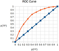
 The ROC diagram, which has been used for many years in the radar field, shows how well the signal can be identified in the presence of the background noise. If the ROC is a straight line, from the origin to the top right-hand corner of the diagram, then there is a 50/50 chance of identifying the defect signal from noise. The nearer the curve is to the top left-hand corner of the diagram, the better the performance of the inspection system.
For more information on the use of ROC see:
http://www.ndt.net/article/ndt-slovenia2005/PAPERS/20-NDTP05-15.pdf
http://www.ndt.net/article/wcndt2012/papers/591_wcndtfinal00590.pdf
What the hec?! articles are not intended to be the definitive account on the topic or acronym in question. Readers’ comments and contributions are welcomed. Email: ndtnews@bindt.org